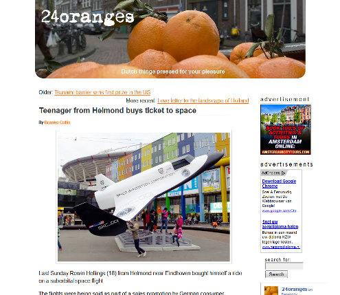
New design to go live today
 Sometime during the day we will introduce a new, temporary site design.
We needed a redesign first and foremost to give space to advertisements. Fortunately we have found a way to do this without sacrificing editorial space. In fact, we have managed to put our main menu and search bar in a much more prominent place than before, and as a result all our other editorial sidebars have moved up a bit.
The biggest victim of this redesign has been the large photo of oranges at the top of the page. The main content column has remained exactly the same.
All in all we hope you will be satisfied by the result.
We hope to bring in a professional designer in the near future who can take a look at the entire site.
If you notice any problems using 24oranges.nl, please let us know.

The old design (2007-2012) started to look a bit long in the tooth.

So now we have squeezed Oranges?
Quite the contrary, we’re apparently doing the squeezing :)