July 21, 2013

Cardboard dividers nets HEMA design award

Filed under: Design,Dutch first by Branko Collin @ 9:25 pm

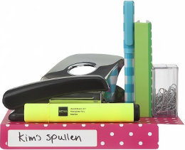
The 2013 HEMA design award was won by Tessa Eising, a student at the University of Twente, for her laminated rectangular cardboard space dividers.

The dividers have one folding edge at both one short and one long side with a label you can write on. The idea is that you put them in a cupboard, fold the edge, write your name on it, and put your stuff on it. As we wrote a couple of days ago, Dutch students often share a flat because of the high rents and they often need to figure out ways to determine who owns what. (In my student days, we shared most of the food and wrote our name on the packaging in the rare cases we needed to reserve something for ourselves.)

Another nominated design that I liked is Kim Monster’s ‘spider’ which you screw onto a standard soda bottle filled with water. Put the bottle ‘feet first’ in a planter and you’ve got a drip for your plants. There is also the travel bottle by Zsolt Hayde with two caps, one for dispensing whatever cream you put into it, the other for cleaning it when it’s empty. Handy for these paranoid times where governments won’t let their electorate onto planes with full bottles.

The HEMA design contest is held every year by the department store of the same name. Winning designs sometimes end up in the store, and it seems that first prize winners are sold through HEMA’s web shop. I have seen 2011’s winner Vrachtpatser, an extension for your bicycle’s luggage rack, in the wild a couple of times. This years prizes were awarded at a ceremony held 11 June at the OBA, the Amsterdam public library.

(Photo: HEMA)

Tags: , , , ,

July 20, 2013

How Heineken branched out into bricks for a short while

Filed under: Design,Food & Drink,Sustainability by Branko Collin @ 11:36 pm

In the 1960 Dutch beer brewer Heineken came up with the idea of using rectangular, stackable beer bottles thinking that they could be re-used as building materials.

Cabinet Magazine writes how Freddy Heineken got the idea when visiting Curaçao in 1960:

[Heineken] noted with dismay the acres of trash underfoot—a good part of it produced by his own company. Heineken Breweries had an efficient bottle-return system in Holland, where the average bottle was used 30 times before being discarded. But without modern distribution, bottles in Curaçao were used once and thrown out. There was no lack of resulting trash: what the island did lack, however, was affordable housing. Heineken had a flash of brilliance: make beer bottles that you can build houses out of.

An initial bottle design by architect John Habraken—a long slender bottle to be stacked vertically—was vetoed by Heineken’s marketing department for being too ‘effeminate’. The second design was the squat bottle you see in the photo. Of this 100,000 bottles were produced and even a prototype shed near Freddy Heineken’s villa in Noordwijk.

(Photo by greezer.ch, some rights reserved)

Tags: , , , , ,

July 19, 2013

No wonder Dutch students live in containers

Filed under: General by Orangemaster @ 12:10 pm

It’s not too much of a surprise that student rooms in Amsterdam are the most expensive in the Netherlands at 100 euro a week, but maybe a little surprising that Dutch student housing is the second most expensive in Europe after the UK at 139 euro a week. Belgian and German neighbours are lucky, paying respectively 66 euro and 57 euro a week.

The typical ‘I’m looking for a room ad’ shows that people are willing to pay just as much and even more than people renting an entire flat to get a room. I also know a lot of Dutch adults who still have roommates, but then the amount of British television shows where adults share flats taught me as a non-European that it’s perfectly normal in Europe.

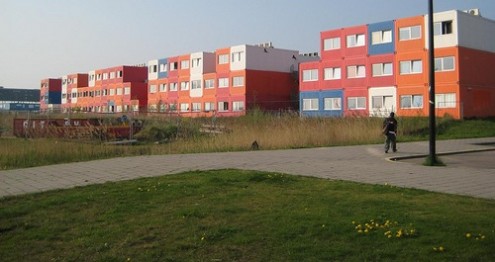
A few weeks ago I was part of a Canadian documentary about Amsterdam North’s NDSM dock area and both cameramen were stunned by the container village (see pic) that students have to live in, first thinking it was some sort of elaborate artwork. When I told them it was student housing, we talked about the differences between Amsterdam and Montréal were the entire crew and myself are from.

Amsterdam style:

– I actually know rich Dutch parents who bought a second house so that their daughter could have a room and share the house with friends.
– There used to be parties in Amsterdam where students could win a room in a house, not rent-free of course.
– Some adults stay in their student room years after graduation because there are very tough laws about throwing people out of their homes.

Montréal style:

– Student housing provided by universities is overpriced and usually full of foreigners who don’t know better. They usually wise up really quickly and get a normal flat.
– Renting a flat is easy, so there is no need for students to live in student housing. They live in flats just like normal people.
– The idea of renting a room in a house is weird. People rent a flat or share a flat, but don’t usually go looking for a room with the assumption that renting a flat is very difficult like it is in Amsterdam.

(Link: www.iamexpat.nl, Photo of Multi-storey container housing by Rory Hyde, some rights reserved)

Tags: , , ,

July 18, 2013

Chinese vase turns family into multimillionaires

Filed under: Art by Orangemaster @ 3:50 pm

In 2003 an anonymous Dutch family inherited a Chinese vase and assessed its worth at 12,500 euro for the tax people. The rare vase of the Han Yuan dynasty then skyrocketed in value between 2003 and 2005 up to 100,000 euro according to the family, due to the many rich Chinese that were interested in buying these vases.

Just 20 months later at an auction at Christie’s in London, the vase went for a whopping 23 million euro. The tax people took the family to court, as they felt cheated and wanted to see a chunk of the megabucks. The family appealed the decision and the court made them settle at 10 million euro.

(Link: www.quotenet.nl, Photo of Chinese vase by epSos.de, some rights reserved)

Tags: , ,

July 17, 2013

Dutch designed 3D printed shoes debut on Paris catwalk

Filed under: Design by Orangemaster @ 12:02 pm

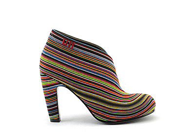
A manufacturer of 3D printers and production systems for prototyping and manufacturing Stratasys has announced the unveiling of 12 pairs of 3D printed shoes during Paris Fashion Week. In collaboration with Dutch designers Iris van Herpen and Creative Director of United Nude (shoe above) Rem D. Koolhaas, Stratasys 3D printed the shoes with a number of intricate geometries designed to mimic elements of nature. Following the success of van Herpen’s recent collaboration with Stratasys for an elaborate 3D printed dress, Van Herpen teamed up with Rem D. Koolhaas to design a tree root inspired shoe.

(Link: www.dutchdailynews.com, Photo United Nude)

Tags: , , ,

July 16, 2013

Dutch tourist tax is the top moneymaker for municipalities

Filed under: General by Orangemaster @ 12:00 pm

This year Dutch municipalities expect to rake in 162 million euro in tourist tax, 62 million more than in 2010. In 2011, 174 of the 418 municipalities hiked up its tax and in some places, the tax at hotels simply doubled.

Of all the municipal taxes, it is the tourist tax that goes up the most each year. And this year 76 percent of municipalities are collecting this cash cow of a tax, as compared to 72 percent last year. Tourist tax on the Wadden Sea islands is quite high with Texel at 26 percent and Vlieland at 42 percent.

The winner is Amsterdam, cashing in on 37 million euro in 2013, and the year isn’t over. A dubious honourable mention goes out to Rotterdam, which got rid of the tourist tax in 2005, but brought it back in 2010.

Paying tourist tax in your own country as a Dutch person does not seem to make much sense, but you could easily argue it. However, it is unclear when and where you pay tourist tax, as every municipality has either a fixed rate or a percentage, looking like a typical Dutch bureaucratic free-for-all that nobody can keep straight.

(Link: www.nieuws.nl, www.etoa.org)

Tags: , , , , ,

July 15, 2013

Joost Swarte designs pair of glasses

Filed under: Design by Branko Collin @ 10:34 am

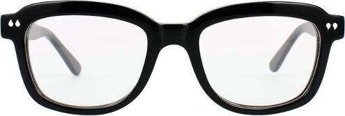
A person might say that Joost Swarte’s dark-rimmed Quotation Marks glasses are ‘expensive’, but that person would fail to see that these 250 euro glasses are ‘design’.

What makes the design of these glasses is a pair of quotation marks displayed on each side of the wearer’s face—which also is the name of the product, Quotation Marks. I can imagine it now, you go to Lukx, the off and online optician, and the sales person says “these glasses really make you what I like to call quote-unquote-you”. And you will say “these glasses really speak to me”. Sale for Mr Humphries!

I guess that in the grand scheme of things, if you are going to pay for a name, that name might as well be that of comics giant Joost Swarte, and you might as well pay 125 euro per quotation mark.

At least you get a free signed and numbered Joost Swarte print when you purchase his glasses.

(Image: Lukx)

Tags: ,

July 14, 2013

Companies rank Dutch banks as barely sufficient

Filed under: General by Branko Collin @ 2:16 pm

One in three Dutch companies wants to break up with its bank, but only one in six thinks this is possible, Z24 reports.

The business news site commissioned a study by DVJ Insights to find out how over 500 entrepreneurs feel about their banks. Most Dutch businesses manage their finances through either Rabobank, ABN Amro or ING, which control about 88% of the market. Of the other banks, German Deutsche Bank is the biggest, or rather, the least small. The big three received grades of around 5.7 out of 10 from their clients—the lowest passing grade. Deutsche Bank, which according to Z24 wants to get rid of its Dutch customers, received a 4.

The article doesn’t mention if any of the smaller banks got high grades.

A third of entrepreneurs is considering switching banks, but about half of them think it would be difficult. A reason given is that they also have a private account with the same bank.

One of the reasons businesses are unhappy with their bank is that banks are reluctant to provide loans. In the past two years a third of businesses requested a loan from a bank, but in 64% of the cases these loans were denied.

Tags: , , , , , , , , , ,

July 12, 2013

Mobility scooters fall over often

Filed under: Health by Branko Collin @ 10:10 pm

A study commissioned by the Ministry of Infrastructure and the Environment revealed that accidents with mobility scooters involve tipping in 70% of cases.
Plus Online wrote yesterday that 20% of these falls was due to inclines, bumps in the road and the likes, while 14% was due to driver error and 7% because the driver took a turn.

The cause of accidents with mobility scooters has become more relevant as the use of mobility scooters in the Netherlands has increased from 150,000 in 2006 to 250,000 in 2012.

The union for the elderly, ANBO, told Telegraaf yesterday that municipalities should provide training to new users of mobility scooters. Project leader Liesbeth Boerwinkel told the paper that matters such as braking and accelerating are confusing: “You need to squeeze the handle to accelerate, but people are used to bicycles with hand brakes. That is one source of problems.”

Both ANBO and traffic safety organisation Veilig Verkeer Nederland have their doubts about making training mandatory. A spokesperson for VVN points out that enforcing training “would be a reason for many people to not to use a mobility scooter in the first place. That would limit their freedom whereas we want to keep people mobile for as long as possible.”

The city of Purmerend recently offered a mobility scooter course to 450 people, Dichtbij writes. One third of them took the city up on its offer. During a two-hour workshop participants had to drive over an obstacle course that contained bumpy surfaces and sharp turns and where they had to practice stopping on an incline and parking.

The workshop was provided by scooter seller Harting-Bank who are in favour of making training mandatory—surprise, surprise!

(Photo by Facemepls, some rights reserved)

Tags: , , ,

July 11, 2013

Child injured on public art, parents take on city hall

Filed under: Art by Orangemaster @ 11:05 am

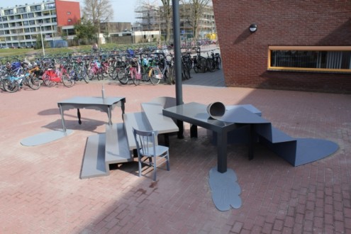
In Hoogeveen, Drenthe, Dutch designer duo Tejo Remy and Rene Veenhuizen designed a place made of painted steel for primary school children to sit down that can also be used as a gathering point for annual class pictures. The artists claim that their work was inspired by children, but is by no means a playground. In fact, painted metal when wet can be very dangerous.

A seven-year-old girl hurt herself so badly on the art that she was rushed to hospital and now her parents are holding city hall responsible for her injuries. City hall replied that art is not a playground and denies any responsibility. Local residents and parents want the thing removed and have started a Facebook page.

Of course kids will play on it, that was to be expected unless you’re from Mars. Kids hurt themselves on normal playgrounds, even with adult supervision. The assumption that kids won’t play on it because it is not for playing is city hall’s argument and that’s really stupid. Parents telling their kids not to play on the art is useless because unless you’re from Mars, kids do stuff when adults aren’t around. There is a general assumption that placing the artwork there was safe, and city hall could be to blame.

I think some building codes should be reviewed. Putting anything with sharp edges near children and expecting them not to hurt themselves is stupid. Blaming artists for designing something that meets all building requirements is fruitless. The decision-makers in Hoogeveen were stupid in placing something so close to children with sharp edges and expect nothing bad to happen.

Put the art work elsewhere, Hoogeveen gets free publicity when the moving happens and praise from the parents, ask the artists’ opinion about the move and they get free publicity, too, everybody happy and safe. Next!

(Links: www.binnenlandsbestuur.nl www.telegraaf.nl, Photo: www.remyveenhuizen.nl)

Tags: ,