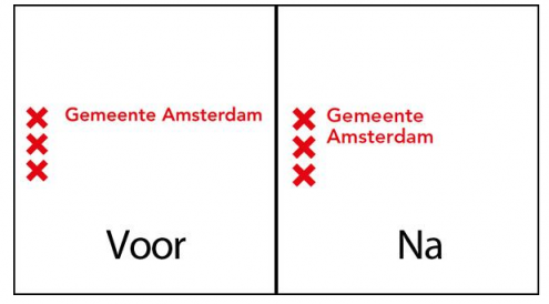
Amsterdam’s new logo or how to hit the Return key
(Voor = before, Na = after)
If Philips wants to go retro and recycle their old logo, let them spin it however they want to because they are a business and tax payers aren’t paying for their logo. When the City of Amsterdam wants a new logo and it costs them 100,000 euro of tax payers’ money but looks like it took a few minutes to make between sips of coffee, then it’s time to ask what’s going on.
The operative words are ‘look like’. The back and forth of calling, mailing and meetings to come up with a plan to redesign a new logo is probably what padded the costs in the first place, but that doesn’t make the result easier to swallow for the masses. The city claims the ‘new” logo is more compact; I see that the words and the Xs are a bit bigger now. However, 100,000 euro is a lot of money from the city to come up with a restyling of a logo that could easily take minutes to make.
(For anybody who want to learn about the three XXXs in the city’s coat of arms instead of making silly assumptions, please read this.)
UPDATE: The designers defend their point.
(Link and screenshot: www.rtlnieuws.nl)


[…] February Amsterdam’s new ‘hit the return key’ logo upset quite a few taxpayers, and now it’s The Hague’s turn to weather the outrage about […]