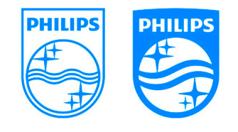
Philips logo goes retro while pay-off moves forward

Dear big cheeses at Philips,
You do realise that your new logo is just a revamping of the old one, with elements from back in the days when you guys were making radios and light bulbs. Sure, retro can be cool, but one wonders about how much work was really put into this as opposed to how well it was pitched to you as being new. In other words, it kind of looks as if you’ve been had: the logo looks like it belongs on a football jersey and the redesigned waves remind me of Pepsi Cola.
Your last pay-off, ‘Sense and Simplicity’, sounded too much like the novel ‘Sense and Sensibility’ by Jane Austen, but I’m sure you got that a lot. ‘Simplicity’ was never really a good idea since you make very complicated products for medical purposes and not just coffee machines for the masses. I could speculate that you were more concerned with trying to convince yourselves than your intended consumers.
Your new pay-off, ‘Innovation and You’, tells me you’ve figured out that ‘simplicity’ was not the way to go and that everyone should benefit from innovation when they buy your products. I like that. However, your retro logo seems to contradict your pay-off: you are trying to move forward while clinging to the glories of the past. That is what hipsters are doing and it’s not really working for them either.
(Link and screenshot: www.amsterdamadblog.com)

[…] Philips wants to go retro and recycle their old logo, let them spin it however they want to because they are a business and tax payers aren’t […]