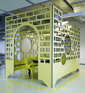
Symbols as furniture in high school
 The frog once sang: it’s not easy being green. This ultra-cool reception area that Tjep designers came up with for a high school in Apeldoorn raises the question how easy it is being in green. Students get to sit on buttons of an old fashioned calculator, get to hang in “key” areas, and get to have meetings in a tiny see-through factory, all executed in bright green. The floor plan looks like a wonderful circuit board, with symbols from the realm of economics replacing plain old conductive pathways. The reception area is in the new economics building of ROC Apeldoorn, that’s why.
The design was nominated for a 2007 Dutch Design Award in the category interior design, where it was beaten by the reception area for chemicals company DSM — the ceiling-wide mirror of which just screams “illicit office sex” to me. But perhaps that’s just me. I’ll shut up now. Go watch the pretty pictures.
Source image: Dezeen Magazine.
Thank you for the tip, Laurent.

Leave a Reply