November 9, 2018

Famous IKEA photo of Amsterdam explained in documentary

Filed under: Art,Bicycles,Photography by Orangemaster @ 3:27 pm

Amusingly called Vilshult, named after a very small town in Sweden, this famous IKEA picture of an Amsterdam canal is world famous. It was taken by photographer Fernando Bengoechea, originally from Argentina. However, sadly, he apparently died during a surfing trip in Sri Lanka in 2004 when a tsunami hit, and his body was never found. You’ll need to watch the whole video below to get the entire story.

After having received the picture from his girlfriend as a present, Dutch director Tom Roes decided to find out all about the black and white picture with the red bike. He has been made fun of a lot and told he had no taste, which probably pushed him to make this documentary. And whether people like it or not, IKEA has sold a whopping 427,000 copies of it.

Here’s the Dutch documentary about the famous IKEA picture of Amsterdam here (cc available in English):

(Link and photo: vice.com)

Tags: ,

October 15, 2011

Uprising in the IKEA catalogue

Filed under: Film by Branko Collin @ 9:56 am

This fun little comedy called Page 23 won the Best Movie award of the 2011 Utrecht edition of the 48 Hour Film project.

It was created by advertising creatives Jeroen Houben, Tim Arts and Stefan van den Boogaard. Contestants had to use a specific character (“Ingmar or Ingrid Talis, volunteer”), a prop (a pair of glasses) and a line of text (“amazingly beautiful, but hopelessly impractical”), and had only 48 hours to create the movie.

Page 23 follows the lives and loves of the models in an IKEA catalogue. The Atlantic published an interview with the makers:

You created a very polished, IKEA-look for the piece with very little time. How did you make it happen in only 48 hours?

We found our location only hours before we started shooting. Since we had no time or money, we looked for something that didn’t need a lot of adjustment. We called around for furnished apartments and hotel rooms, but no luck there. Finally, it turned out one of our crew members had a clean-looking, design-furnished apartment. Sometimes it’s just that easy. We bought some extra decoration like candles and a vase with flowers, and most of the other stuff you see in the shot was already in the house. The funny thing is most of the furniture in the shots aren’t IKEA products.

[…]

(Video: Vimeo / Jeroen Houben)

Tags: ,

January 13, 2008

Most visitors still to Efteling; loses number 1 brand spot to Ikea

Filed under: General by Branko Collin @ 6:51 pm

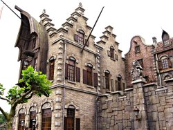
Illustration: Houses at Efteling in Anton Pieck style, photo by Danny Haak. Some rights reserved. 

Amusement park Efteling is still the most visited attraction in the Netherlands according to RTL (Dutch). The zoos at the number two and three spots of 2006 changed places last year; Blijdorp came in second, and Burgers third. Burgers feels the swap can be explained by the extra attention Blijdorp got after gorilla Bokito escaped there.

Efteling suffered a blow in another ranking though: that of strongest brand of the Netherlands. Where it led two years ago, now it has to let foreign companies Ikea (1st) and Google (2nd) ahead. The amusement park based in Noord-Brabant comes in fourth, according to the ad agency Consult Brand Strategy (Dutch, PDF), after Cliniclowns (care clowns).

In 1952 Efteling opened its doors to the public. The park was designed by Anton Pieck, whose pictures of small winding streets with crooked, cosy houses found a welcome echo in the park’s architecture and landscaping. Originally little more than a tea house in green surroundings, the park soon added its fairy tale forest with life size depictions of well known fairy tales (trick question: name three of the seven dwarfs from Snow White), and from the 1970s onwards it acquired all the usual amusement park traits such as dark rides, fast rides, a hotel and a golf course.

Tags: , , , , , ,