April 17, 2018

Den Helder gets platform over the sea

Filed under: Architecture,Design by Orangemaster @ 12:07 pm

mvrdv-2

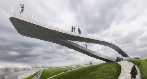
Rotterdam-based architecture firm MVRDV won an international competition with their design of a Möbius strip like viewing platform called SeaSaw for the city of Den Helder, North Holland, the northernmost point of the mainland, across from the island of Texel.

Set to be completed in 2019, the platform will offer an all-around view meant to underline the city’s connection to the sea. And although Den Helder is a charming place where you can enjoy the sea, the country’s main naval base, the end of the railway line and generally nice folks, it also has some ugly old buildings that were in the running for the best ugly place in North Holland.

(Link and image: designboom.com)

Tags: ,

December 2, 2017

Colourful puzzle hotel unveiled in Eindhoven

Filed under: Design by Orangemaster @ 10:24 pm

mvrdv-2017

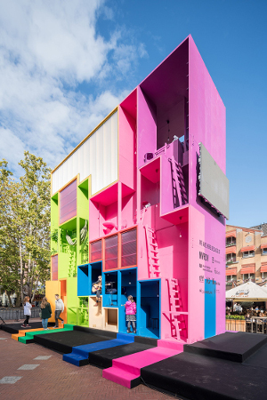
In October 2017 during Dutch Design Week in Eindhoven, design firm MVRDV unveiled (W)ego, a “concept for accommodation that can adapt to the different needs of any future inhabitants – whether they be families, students or refugees.”

It looks like the game Tetris hung out with Lego and created colourful rooms for students. Co-founder of MVRDV Winy Maas, who was one of Dutch Design Week’s three ambassadors, said “Through gaming and other tools, (W)ego explores participatory design processes to model the competing desires and egos of each resident in the fairest possible way.”

(W)ego is basically a hotel where guests have to deal with the dream spaces of other occupants. It was exhibited downtown Eindhoven last October back when the weather in the Netherlands was still nice.

(Link and photo: urdesignmag.com)

Tags: , ,

May 18, 2016

Rotterdam’s stairway with a view of the city

Filed under: Architecture by Orangemaster @ 7:12 pm

MVRDV-the-stairs-rotterdam-giant-staircase-installation-designboom-03

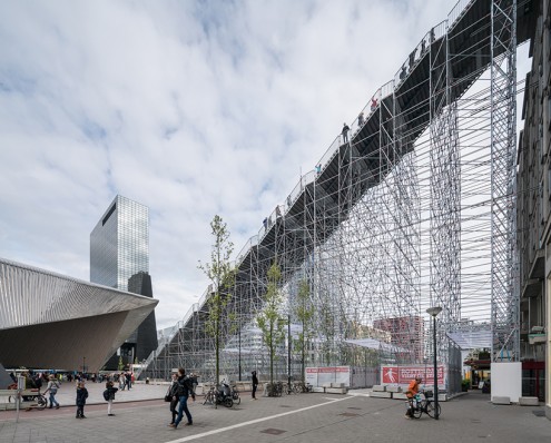
Right outside Rotterdam Central Station, architectural firm MVRDV has built a giant staircase that goes from the station’s plaza all the way to the top of Rotterdam’s ‘Wholesale trade building’ (‘Groothandelsgebouw’), a monumental building right next to the station.

The structure pays tribute to Rotterdam’s rebuilding efforts during WWII and will remain open to the public until June 12, 2016 between 10am and 10pm. Winy Maas, co-founder of MVRDV explains that “this installation shows what this city could look like if we do that in many places, engaging a series of our existing buildings and giving access to their roofs, to create a new, much more interactive, three dimensional and denser urban topography for the next city generation.”

The staircase has 180 stairs and is 29 metres in height once you’re on the roof where there’s a temporary observation deck overlooking Rotterdam, a city that actually has skyscrapers. There’s also a rooftop cinema open especially for the event that offers a wide variety of films, debates and performances.

(Link and photo: www.designboom.com)

Tags: , ,

April 22, 2016

Chanel in Amsterdam boasts unique glass façade

Filed under: Architecture by Orangemaster @ 3:26 pm

Chanel.PCHooft

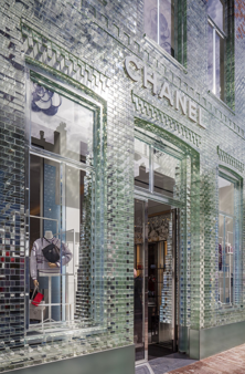
A few days ago, the fanciest shopping street of Amsterdam, the PC Hooftstraat, inaugurated a glass façade at the Chanel shop, attracting a lot of attention from passers-by. The creators, Rotterdam studio MVRDV, apparently used pioneering glass technology to replace the brick front of a former townhouse with a transparent replica.

MVRDV explains that the glass bricks are held in place with a transparent high-strength glue, and the construction is in many ways, stronger than concrete. Higher up the building, the glass elements merge with the original brickwork to create the illusion of a dissolving wall. Every change in daylight can now be seen, and the sun changes the aspect of the façade.

“Until the 1950s, the PC Hooftstraat was a residential street, and slowly turned into a shopping street with big brand names and foreign tourists. Eventually it plans to become as famous as the Champs-Élysées in Paris or the Ginza in Tokyo, but for now it is still busy transforming itself from provincial shopping street to international shopping street.

(Link: www.dezeen.com, Photo: www.architectenweb.nl)

Tags: , ,

October 22, 2015

The Couch, a combined grandstand and clubhouse

Filed under: Architecture,Sports by Branko Collin @ 2:52 pm

the-couch-mvrdv

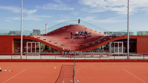
Tennis Club IJburg in Amsterdam has 10 clay courts, a tennis school, 1,100 members and now also a clubhouse designed by MVDRV for an undisclosed amount of money.

The clubhouse cleverly doubles as a roofless grandstand that seats 200 people. One wonders if MVDRV was perhaps a little inspired by a classic football stadium in their home town of Rotterdam, Het Kasteel (The Castle), which also has stands dipping around a space with windows.

The building was officially opened in August. The clubhouse has a bar, seating areas, and, to the side, dressing rooms, bathrooms, a kitchen, and storage space.

IJburg is new land, which allows the Dutch a rare opportunity to experiment with lots of fresh architecture in one place..

(Link: Arch Daily, Photo: MVRDV)

Tags: , , , , , ,

March 22, 2015

Boijmans van Beuningen to build special satellite

Filed under: Art by Orangemaster @ 8:00 pm

despiegelpot_thmb-229x130

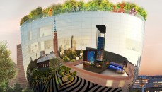
To be designed by Rotterdam architecture firm MVRDV, the Museum Boijmans van Beuningen in Rotterdam wants to build a € 50m private art depot to display its artworks along with the ones of private collections. This would mean an additional 145,000 artworks could be seen, which otherwise would stay hidden from view.

The museum sees this as a great way to fund itself. “We are stimulating the market and taking a piece of the market back to the museum,” director Sjarel Ex explained at a presentation at the Tefaf art fair in Maastricht on 13 March.

The ‘collection building’ does look like a bit like a salad bowl and would be built next to the existing museum. Some 10% of the space would be rented out to private collectors. The museum also plans to facilitate loans, produce condition reports and provide other collection management services.

Rotterdam’s city council will vote on the proposal on 20 May and it it is approved, the depot would open in 2018.

(Link: www.theartnewspaper.com, Photo: collectiegebouw.boijmans.nl)

Tags: , ,

January 23, 2015

Rotterdam firm to make twisted building in Vienna

Filed under: Architecture,Food & Drink by Orangemaster @ 10:06 am

Turm-mit-taille_MVRDV_Vienna_tower_dezeen_468_5

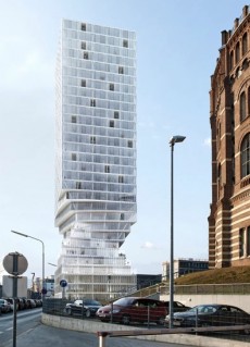
Rotterdam architectural firm MVRDV has won a contest to design a new skyscraper in Vienna by proposing a 110-metre tower with an “elegant, hourglass figure” that will reduce the impact of its shadow. The contorted form is said to prevent any of the surrounding blocks being in shadow for longer than two hours a day.

The initial comments on this building is ‘maybe it is possible to use too much glass’. The heat that will generate in summer would required specially treated glass, and ‘the bit about being concerned about shadow is creating a problem where there isn’t one’, although in some Asian countries like Japan it’s a huge deal.

MVRDV are well-known for other much talked about projects, including Rotterdam’s horseshoe-shaped market hall that will be getting a Jamie Olivier Italian restaurant soon, even though there are already two pasta places.

(Link and image: www.dezeen.com)

Tags: , ,

September 29, 2014

Exploring the Dutch World Expo building in Hanover

Filed under: Architecture by Branko Collin @ 1:16 pm

dutch-expo-2009-matthias-hensel

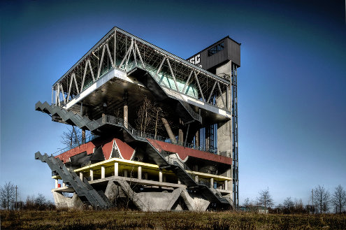
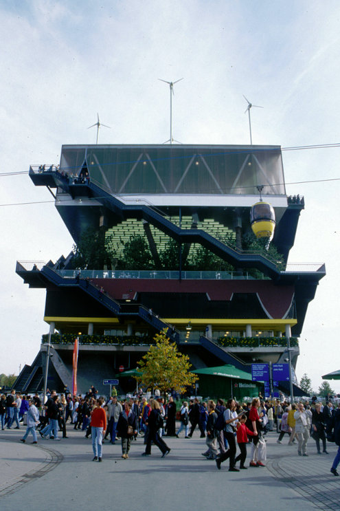
Here is the Dutch pavilion of the 2000 World Expo in Hanover, Germany, or rather what remains of it.

MVRDV from Rotterdam designed the building to showcase how water, wind and will power combine to form the Netherlands. The tallest building of the expo at 36 metres featured five different landscapes on five different floors. The fourth floor symbolised a water landscape and had walls of water. The other floors didn’t have walls at all. The third floor carried the top two with columns made from oak stems.

Last week Der Spiegel visited the expo grounds to see what happened with the buildings countries had erected there:

The wild forest on the third floor of the Dutch pavillion is Sylvia’s favourite spot. This afternoon the 15-year-old has gone again to the graffiti riddled ruin which is called the “Holländer” by the citizens of Hanover, a building that looks like a monstrous parking garage with stairs on the outside.

To urban explorers like Sylvia [and her friend Kai] the exposition grounds are like a playground. Adventurers come here all the time—to explore what is left behind of the World Expo, to spray, to party, to make love.

Initially there were plans to keep the Dutch building in use. In 2003 a centre for renewable energy was going to be housed in the building, but a backer pulled out citing health problems. Another plan was to use it for a shrimp farm! According to Archined in 2010, the owner probably wouldn’t mind if the building collapsed on its own — much cheaper than having it torn down. The building permit for the oak columns ran out in 2005.

dutch-expo-2000-sommerci

See the Spiegel article for more photos of the exposition grounds or search Flickr.

(Photos: the ruins in 2009 (top) by Matthias Hensel, some rights reserved; and the Dutch pavilion during the expo (bottom) by Sommerci, some rights reserved. Link: Z24)

Tags: , , , , ,

February 3, 2013

Glass building printed with farm texture by MVRDV

Filed under: Architecture by Branko Collin @ 12:08 pm

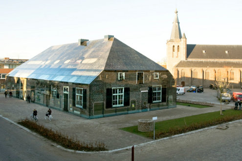
As the architect’s web page crudely puts it, after Operation Market Garden in World War II the Dutch town of Schijndel in North Brabant was left with an ‘oversized’ market place.

MVRDV’s founder Winy Maas had been lobbying town hall to do something useful with all that space, and after his seventh attempt, he finally got his wish. On 17 January the building of the glass farm on the Markt in Schijndel was completed. The building is made to look like an oversized farm (scale 1.6:1) and is made entirely out of glass, on which a texture has been printed.

MVRDV writes:

The building with a total surface area of 1600 m2 contains shops, restaurants, offices and a wellness centre. The exterior is printed glass with a collage of typical local farms; a monument to the past but 1.6 times larger than life.

In collaboration with MVRDV, artist Frank van der Salm photographed all the remaining traditional farms, and from these an image of the ‘typical farm’ was composed. This image was printed using fritted procedure onto the 1800 m2 glass facade, resulting in an effect such as a stained glass window in a cathedral. The print is more or less translucent depending on the need for light and views.

The print lets in light from outside during the daytime and the building is illuminated from the inside during the night.

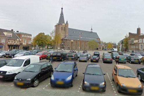
This is what the square looked like in October 2010 according to Google:

(Photo: MVRDV)

Tags: , , , ,

May 31, 2009

Tower of books for Spijkenisse signed MVRDV

Filed under: Architecture by Orangemaster @ 12:02 pm

book-mountain-by-mvrdv-6mvrdv_tp230_spijkenisse-bijpg

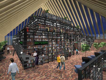
It’s time to write more about Dutch design firm MVRDV now that Rotterdam, as well as the nearby city of Spijkenisse, where this library is to be built, are getting architectural makeovers.

Completion of the building is scheduled for fall 2011. With a surface of 10,000 m2, this public libray will be an example of energy efficiency and advertise reading through its design of a book mountain. In addition to the book collection and reading areas, the library will accommodate commercial facilities, offices, an auditorium, conference rooms, and exhibition spaces.

Let me see:
– I have problems with the fact that direct sunlight is hitting books, although there is talk of solar protection. Probably a normal response.

– Call me politically correct, but all that climbing for the elderly and the likes got my attention. Again, I could be wrong, but that is more often than not a problem in the Netherlands.

– I do like the Dutch ‘obssession’ with showing the insides of buildings (the Muziekgebouw aan het IJ in Amsterdam came to mind). I once read that even showing the insides of canned foods worked well in the Netherlands.

– The whole Library of Alexandria meets Louvre Pyramid “in traditional Dutch barn yard style typology” needs some getting used to. Apparently, the shape and choice of materials is a reminder of the agricultural history of Spijkenisse, “now a suburban area of Rotterdam with statistically a low average of readers.” Politely put, it’s full of low income families who just don’t read (or can’t) and couldn’t care less what their ‘burb of Spijkenisse used to look like.

So yes, please build these folks a nice public library. Right on.

(Link and photo: dezeen.com)
Tags: ,