September 10, 2012

Will Amsterdam Central Station be ‘kerned’ correctly?

Filed under: Architecture by Branko Collin @ 9:18 pm

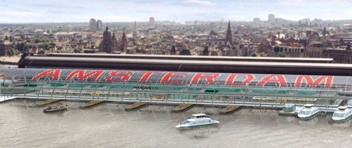
Amsterdam Central Station is getting a new bus terminus, and architects Benthem Crouwel have decided to adorn the terminus’ roof with the word ‘Amsterdam’ in giant red glass letters.

Famous Dutch graphic designer Piet Schreuders is worried that the letters may not be spaced correctly (kerned, as typographers call it), and watches the roofing process like a hawk, sharing his observations at Typographica.org.

Today, in September 2012, the middle section of the roof is still missing, so all we can see is AM…RDAM. (The letters STE won’t be inserted until 2013, when construction of the underground North-South tram line at this location is expected to be finished.)

Being worrisome by nature, we typographers can’t help expressing some concerns: did the architects and roofers calculate everything exactly right? Will the missing letters fit into the remaining space? And did the roofers adhere to proper kerning specifications?

Fact: the word AMSTERDAM starts and ends with the letter combination AM. The first worrisome fact: the space between the first A and M is five windows … but between the second A and M—oh, horror—it is only four.

Earlier this month the Rijksmuseum Amsterdam presented its new logo which had too much space in it, right at a position that suggested a case of ‘English disease’, as the Dutch call it—the habit of putting spaces in compound words. That space caused a lot of buzz on the Internet—I doubt Benthem Crouwel’s typography will yield a similarly rich word of mouth.

(Illustration: Benthem Crouwel Archtitects)

Tags: , , , ,

November 12, 2008

Laurel & Hardy’s city in 3D

Filed under: Art,Film,History by Branko Collin @ 12:05 pm

In 1998, Piet Schreuders and “a team of computer graphics experts” from Utrecht dedicated their time to recreate Main Street, Culver City in digitized 3D form. They used “historical records to design a digital version of Culver City as it looked in 1920s-era Laurel and Hardy films and other motion pictures from the Hal Roach studio,” as BoingBoing says.

We wrote about Schreuders here on this very blog not two weeks ago. BoingBoing also links to a copy of of Schreuders’ other magazine, Furore, which is devoted entirely to describing the process: “The Shortest Main Street In The World.”

Tags: , ,

November 2, 2008

Geometric family tree as birth announcement card

Filed under: Comics,Design by Branko Collin @ 5:35 pm

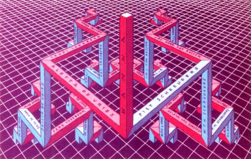
Piet Schreuders, him of the Poezenkrant (which is not about cats), designed this card in 1984 on occasion of the birth of his daughter Anna. It’s a family tree that goes back four generations, pink branches signifying girls, blue ones boys. It’s one of the reasons that the Fool’s Gold editors clamour for a Schreudermania book.

Ah, speaking of Fool’s Gold. People forgot to tell my clients that there’s an economic crisis supposed to be going on, and as a result I haven’t really had the time to review the latest Zone 5300. Issue 83 is all about Outsider Art. Like every other issue of Zone 5300. Which they sort of acknowledge in the foreword, then still power on.

The good thing though is that as part of that whole Outsider Art thing Fool’s Gold got two extra pages in full colour. Comics are mostly by the regular contributors. Lamelos’ Sam Peeters goes solo this time with In de schaduw van mijn lul (In the shade of my penis), which manages to pack armed robbery, monkeys, slipping-over-banana jokes, faeces, swamp things, camp fires, steaming hot sex, and a gruesome beheading all in six small pages, in that order. I thought you ought to know.

Zone 5300 also checks out how Teun Hocks, illustrator to amongst others The New Yorker and Harper’s Magazine is doing these days. He’s doing… wait, buy the damn magazine already!

Tags: , , , , ,