October 29, 2008

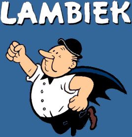
Lambiek comic book store turns 40

Filed under: Comics by Branko Collin @ 8:22 am

Not withstanding a recent lament (Dutch) by Dutch comic giants Hanco Kolk and Jean-Marc van Tol about the decline of the local comics scene, comic book store Lambiek is still going strong. Next week the store even celebrates it’s fortieth anniversary. As they put it themselves: “[Lambiek] is probably the oldest existing comics shop in the world.”

The store in the heart of Amsterdam, just off the busy Leidsestraat, is named after a character from the popular Flemish series Suske & Wiske who in turn was named after the beer. To those who don’t shop for comics in Amsterdam—what’s wrong with you?—Lambiek is probably best known for its online comiclopedia, an encyclopedia of comic artists from around the world in English and Dutch.

Tags: , ,

July 19, 2008

Why people buy the wrong house

Filed under: Architecture,Science by Branko Collin @ 2:53 pm

Earlier this year researchers from the Radboud University in Nijmegen published a paper that explored why people make wrong decisions when choices are complex, for example when buying a house or choosing a vacation. According to the authors, we over-think things. For instance, when we buy a house, we might attach a higher weight to a large room (“grandmother can sleep there when she stays over”) than to a long commute. The longer we think about this, the more scenarios we think up of what we might use the room for, adding more weight to that choice.

But the real-life importance of the room does not increase with all the uses we can imagine—it’s still going to be used a few days on average each year—whereas the long commute will become a royal drag after a while.

Another problem of over-thinking is that it tends to exaggerate framing effects. Framing is what you do when you look at choices from a certain angle. The choice for a large house can be viewed in terms of space, but also in terms of energy costs. It turns out that different frames lead to different choices, and that more framing leads to wrong choices.

The scientists suggest that if you want to make a complex decision, you still weigh all the factors, but then sleep on it for a while, until the decision just—poof—pops into your head.

(Via The Frontal Cortex. Photo by Doratagold, distributed under a Creative Commons Attribution-Share Alike 2.0 Generic license)

Tags: , ,

December 21, 2007

Pedal exerciser from the 1990s revisited

Filed under: Gadgets,Sports by Branko Collin @ 4:00 pm

Lifehacker’s Gift Guide 2007 for the suave and discerning geek of the noughties acknowledges that the best mods only go with the best bods, so it presents you with a pedaling device called the under-the-desk exerciser (sounds like a Christmas party to me!) to put under your desk or WoW station. But Booklog stands them up with its review of the 1990 summer edition of the Wehkamp mail order catalogue. The “teletrapper” exerciser was sold to an unsophisticated TV dinner crowd even back then, for an even hipper price (in guilders, with about 2 guilders to 1 US dollar).

As one person commented at Lifehacker notes, your desk needs to be higher than waist level, or else you will keep bumping your knees. Of course, if your desk is higher than waist level you’re just begging for RSI. One good solution for that is to get up every 40 minutes or so and take a five minute walk around the office. Once you’ve started doing that, you won’t really need a exercising device, though. Choices!

Tags: , , ,

December 20, 2007

No condom shaped lights for the Warmoesstraat

Filed under: Design by Branko Collin @ 6:21 pm

The Warmoesstraat is one of the oldest streets of Amsterdam and the gateway to the famous Red Light District. The street’s business association wanted to see the wares it sells reflected in its seasonal lighting, and therefore ordered the manufacturing of lights in the shape of condoms, handcuffs, magic mushrooms and so on. But it wasn’t to be: due to a construction error the light that would have been revealed tomorrow turned out to be too heavy to be hung.

The lighting idea was the result of a competition held by the business association and won by Toko 73 and Coolpuk, who also came up with a new logo. I also liked the idea of Carmela Bogman to use LED lights to create an understated, moon-shaped display that would bring visitors back to a darker bygone era, thereby underlining the age of the street—although the actual designs were a bit “Ot en Sien” (tacky).

Illustration by Toko 73 and Coolpuk.

Via Dutchnews.nl.

Tags: , , , , , ,

April 19, 2007

Bike doubles as shopping cart

Filed under: Bicycles,Design,General by Orangemaster @ 8:34 am
fiets2.jpg

So many kinds of bikes exist in the Netherlands, a land with more bikes than inhabitants. Now it’s time for the multifunctional Feetz (pronounced ‘fiets’, the Dutch word for bicycle). Industrial designer Lennart Vissers and his father Herbert Vissers came up with the design. The tricycle has two wheels on the side that turn in corners and handles like a bicycle. It can easily accommodate a bag of groceries or a child seat and when it is folded up, it can be used as a shopping cart.

For the expats and foreigners out there: the child looks very unsafe with no helmet and all, but that’s the way people bike here. For the Dutchies: no, it’s not safe and yes, there are a lot of bicycle accidents, which are not taken seriously until someone dies. It’s a cultural thing.

(Link)

Tags: , ,